Nomadic Matt's Travel Site
Travel Better, Cheaper, Longer
Search for:
About
Blog
Latest Posts
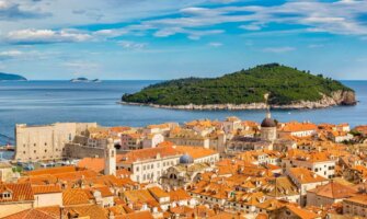
The 6 Best Hotels in Dubrovnik
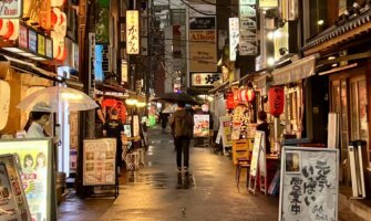
How to Spend Your Time in Tokyo: A Suggested Itinerary
The Perfect 7-Day Japan Itinerary for First-Time Visitors
Popular Posts
Everyone Says I’m Running Away
The Ultimate Guide to Traveling Cheap
Travel is a Privilege
Why There’s no Perfect Time to Travel
Travel Tips
Get Inspired
How to Save For a Trip
How to Plan Your Trip
Get the Right Gear
Find Cheap Airfare
Get Accommodation
Life on the Road
Solo Female Travel
Family and Senior Travel
Destinations
Resources
Blog School
Favorite Travel Companies
Book Accommodation
Book Your Flight
Get Travel Insurance
Favorite Hostels
Travel Credit Cards
Books
About
Blog
Latest Posts
The 6 Best Hotels in Dubrovnik
How to Spend Your Time in Tokyo: A Suggested Itinerary
The Perfect 7-Day Japan Itinerary for First-Time Visitors
Popular Posts
Everyone Says I’m Running Away
The Ultimate Guide to Traveling Cheap
Travel is a Privilege
Why There’s no Perfect Time to Travel
Travel Tips
Get Inspired
How to Save For a Trip
How to Plan Your Trip
Get the Right Gear
Find Cheap Airfare
Get Accommodation
Life on the Road
Solo Female Travel
Family and Senior Travel
Destinations
Resources
Blog School
Favorite Travel Companies
Book Accommodation
Book Your Flight
Get Travel Insurance
Favorite Hostels
Travel Credit Cards
Books
Latest Blog Posts
The 6 Best Hotels in Dubrovnik
How to Spend Your Time in Tokyo: A Suggested Itinerary
The Perfect 7-Day Japan Itinerary for First-Time Visitors
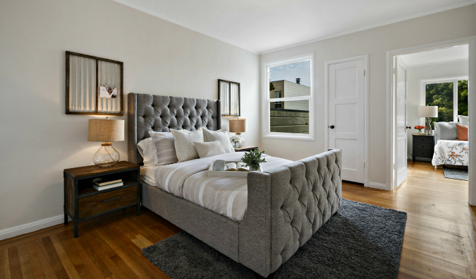
How to Find the Perfect Apartment for Vacation Rentals
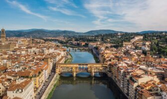
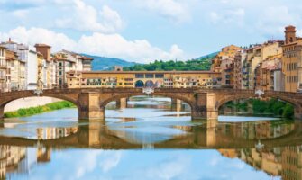
The 6 Best Hotels in Florence
Where to Stay in Florence: The Best Neighborhoods For Your Visit
TravelCon is Back! Come Join Us!
How to Plan a Trip: A Month-by-Month Guide
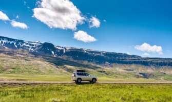
13 Iceland Road Trip Tips: What You Need to Know Before You Go
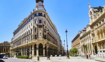
The 7 Best Hotels in Madrid
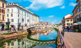
Where to Stay in Milan: The Best Neighborhoods for Your Visit
The 6 Best Hotels in Prague
1
2
3
4
5
…
88
Can't find what you are looking for? Use the search form below to search the site!
' . __('Search for:') . '
Get my best stuff sent straight to you!
Send Me Tips
Pin It on Pinterest